Plotly is a web-based tool for creating charts. While it has a powerful suite of possibilities that are available for a fee, the free version is excellent for getting started. Charts created and saved with the free version must be public.
Navigate to Plotly
- Create an account by clicking the “Log In” button and then choosing the option to “Sign Up”
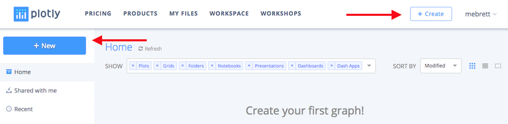
- Once you’ve created an account, you will land on your Plotly homepage, were you can begin by either clicking the “New” button in the left navigation column or clicking the “Create” button in the header. Rolling over each button will offer you a menu of outputs.
- Select “Chart.”
- This will bring you to your creation interface, where you will add your data and customize the look and feel of your chart:
- Import a data set by clicking on the “Import” button in the header. Download this selection of census data from 1820 in Maryland to your computer and then upload it to Plotly.
- Notice that this tool has a three column interface. The far left menu controls the editing interface that is in the middle column, and the data and the resultant chart are shown in the main column which takes up the bulk of the page.
Create a Bar Chart
- First, we need select a chart type. In the middle area, under Chart Type, click where it says “Scatter plot” top open a menu of chart options. There are a number of chart types; select Bar Chart.
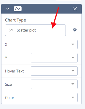
- The drop down menus for the X and Y axis will allow you to select columns to plot in your chart.
- Since this data is all from one year, we won’t have a time axis, but if we did we would probably want to anchor that along the X axis.
- For the X axis, use Area Name, which is the Maryland county for the data.
- The Y axis is up to you – select one of the other columns.
- Click on the “Style” option in the far left navigation column
- This will open a context menu with many choices.
- For now, select “Axes” and write in labels for X & Y.
- Now that we’ve got a solid bar chart that shows some factor of population in 1820 by Maryland county, try adding a comparative element.
- In the far left menu, click “Create” under “Graph” to return the building menu.
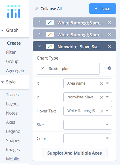
- Click the blue “Trace” button (above the Chart type menu) in the creation interface to add a new layer.
- Select Area Name for the X axis
- Select a new column for the Y axis to add a new set of bars to your chart.
- Returning to the “Style” menu, if you click “Traces”:
- you can adjust the colors for your bars, and
- decide where you would like them grouped, or stacked.
- Don’t forget to click in the Title field on your chart to give it a descriptive title.
- Finally, in the bottom left menu, Save your chart and your data. You have to option to set your chart as public, viewable only with a link, or private.
Create a scatter plot
- From the drop down menu attached to your username in the upper right hand corner, select “New Chart.”
- Import the data again.
- The default chart selection is Scatter Plot, so we can leave that.
- Set your X axis to Area Name, and choose a value for the Y axis column.
- Add traces until you’ve built up comparative data the appears useful.
- Label your X and Y axis.
- Go to the Traces menu in the Styling section of the far left navigation and consider your options: Lines? Symbols? Size? Hover text? How do these choices change the way your data might be interpreted by viewers?
- In the Create menu, explore the “Subplot and multiple axes” options for each trace. How does this change the legibility of the data?
- Save the project.
- Once you have saved a project, you can share your work using the “Share” button on the left side of the using a link or an embed code.
Below is just one example of how you might craft a scatter plot:
Explore the Plotly Tutorials for more help.