This lesson is adapted from Lincoln Mullen’s Spatial Humanities Workshop lesson, updated for the current version of Carto.
Building Data Maps
Data, or thematic, maps show one or more data points (themes) arranged spatially, either with specific geographic coordinates or relative location. Maps generally are composed of points (an exact place on the earth, represented by latitude and longitude coordinates), lines (a connection of multiple points, like a road), and shapes (a connection of multiple lines, like a building or the boundaries of political entities, ie, counties, states).
Examples of data maps include late 19th century maps as well as modern animated maps. Compare these two linked maps and consider the similarities and differences between them.
There are many tools to create maps, this tutorial is for Carto.
Before you begin, create an account for Carto: http://carto.com
Sample Data
Download the dataset “Locations in Amersterdam” from http://lincolnmullen.com/projects/spatial-workshop/resources.html. Clicking on the dataset name will download the dataset as a zipped file. Unzip the file.
Before you look at the data, read Lincoln’s blog post discussing the research questions
Open the zipped files and look over the data (they can be opened using a spreadsheet program like Excel or GoogleSheets. Using the data sets and the blog post, answer the following questions:
- Where did Matthew Lincoln get his data?
- How did he gather it?
- What research questions did Lincoln have?
- How do these questions shape the data?
- What information do the files hold?
- Where is the spatial data? What kind of spatial data is there?
- What is the relationship between the files?
Using Carto
Sign in to your Carto account. From the dashboard select from the dropdown in the upper left hand of the window and click “Your datasets”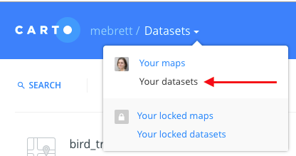
You should see a page that says “There are no datasets”
Click the blue “New Dataset” button on the upper right hand side of the screen. Using the option to Upload a file, upload the period_place_stats.csv file from the unzipped Locations in Amsterdam set that you downloaded earlier. Then click the Connect Dataset button which appears at the bottom of the page on the right-hand side.
It may take a minute for the dataset to load.
The dataset is tabular data, the same as the csv (if you like, you can open the file from your download using a spreadsheet viewer like Excel). Carto has made a few changes to the set we uploaded.
First, it has assigned a type (https://carto.com/docs/tips-and-tricks/data-types/) to each column, setting it as a number, a string (set of characters), boolean (true or false), or a date. Because Carto sets these automatically it’s always a good idea to review and make sure that it has properly classified each column.
In addition, Carto has created columns for cartodb_id (an id number for each row) and a column the_geom which combined the latitude and longitude columns to create geographic point locations.
Once you have reviewed the data, click the blue “Create map” in the bottom right-hand corner.
The page will load with a map of the points from the dataset on the right side and an editor on the right. Click to select the “period_place_stats layer.
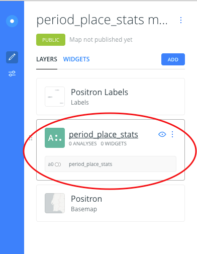
Clicking to select the layer will take you to a set of options for modifying the map features:
- Data: allows you to add data (columns) as a widget
- Analysis: you can add an analysis of a data set (this usually works best with multiple layers, or datasets)
- Style: controls how the points are displayed. Can you map the count variable to the size of the markers? To the color of the markers? Can you cluster the markers together, or display them in a heat map? Can you attach labels to the points?
- Pop-Up: controls what happens when you interact with the points. Can you display information when points are clicked?
- Legend: determines how the points on the map are explained. Can you create a legend which accurately explains what your map is displaying?
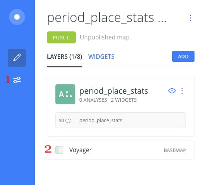
The slider icon in the left-hand bar (1 in the image above), just under the edit/pencil icon, allows you to set options for the public view of the map, for example turning off the search function within the map.
The label Voyager under the list of layers (2) allows you to change the source and style of the basemap.
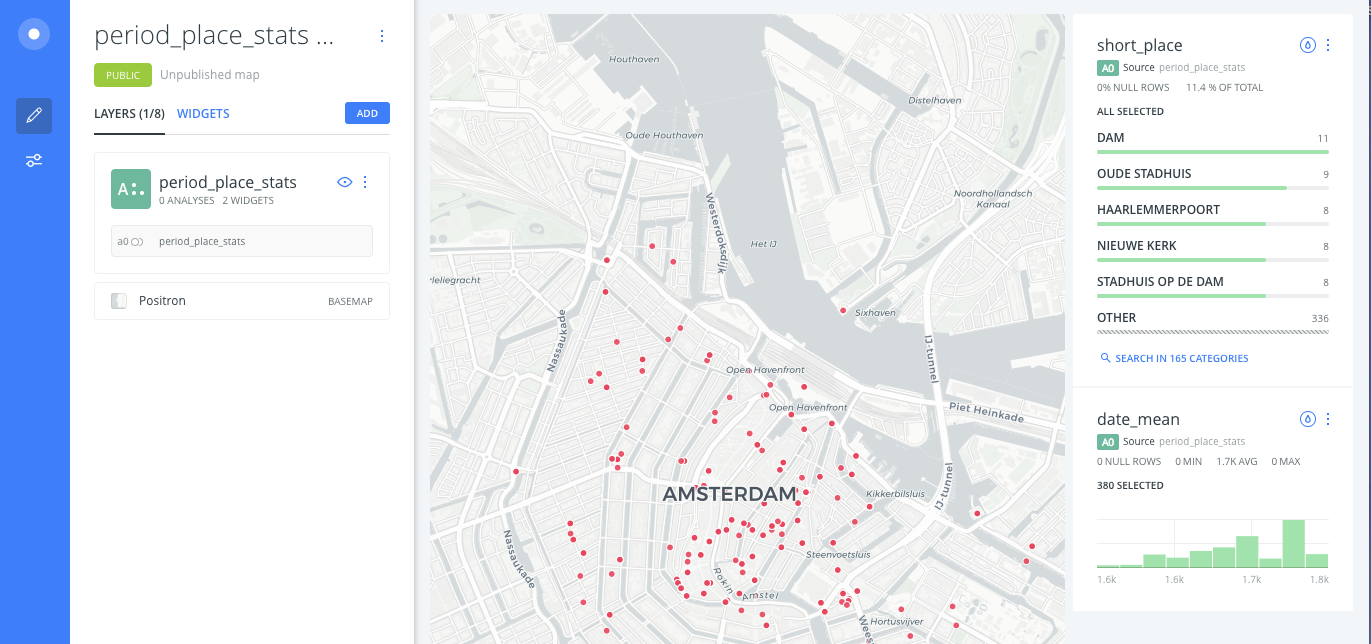
The image below is just one example of how your map may look.
Questions to ask of the map
What questions about art or art history does this data allow you to ask? What answers can the map provide? How can you use the features of the map to ask and answer these questions? How can you use the map to mislead people with regards to the data?
Further Exploration
Once you have run through Mullen’s tutorial, try out some of the guides offered by Carto, for example Getting Started with Carto Builder and Animating Maps with Point Data.